 Data Science and COVID-19
Is San Marino really the centre of the coronavirus?
The onset of COVID-19 has led to a torrent of statistics and graphs as the virus wreaks havoc across the world. A number of initiatives have been setup to filter and centralise data across the globe. To name but a few:
- The European Centre for Disease Prevention and Control publishes daily updates on COVID cases and deaths for each country
- The Johns Hopkins University host a Coronovirus Resource Center with worldwide data, dashboards and analysis
- The World Health Organisation publish updates on the virus situation
as well as the hundreds and probably thousands of sites across the globe providing their own insights on the pandemic.
The quantity data of seems overwhelming, yet one statistic seems to cut through unlike any other: the number of COVID-19 deaths. This is not just another figure: these are real people who have lost their lives to the virus.
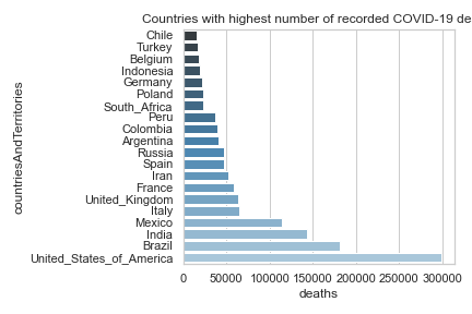
Analysing the death toll would seem relatively straight forward. For example, this project has a regularly updated graph showing the top 20 countries with the highest number of COVID deaths:
And yet, we know that policies for recording even this most basic of statistics - the number of COVID deaths - vary enormously across the world.
- Some countries only track hospital deaths while others include deaths in care homes and other places.
- Others perform post-mortems to determine if COVID was a factor in the death while other countries only include the figures if the deceased already tested positive for the virus.
- Other countries distinguish between those deaths caused by the virus and the deceased that just happenned to have the virus (and died of an unrelated illness).
- Updates to mortality statistics occur at different frequencies.
And so on. And all of this before we even consider how effective a country is at following its own procedures, or how the procedures may have evolved over the lifetime of the pandemic.
The nuances and discrepancies across the globe seem to make it almost impossible to make any meaningful comparison between countries. And yet, the need for some kind of comparison is stronger than ever, if only to provide some kind of feedback on how effective each country is combatting the virus to inform future decision making.
Let’s put aside our reservations on the data itself and return to the earlier graph.
We know that Europe has been hard-hit by the virus, and sure enough, many european countries appear in the list. We also know that some countries have been hit very hard, namely Italy, Spain, the UK and France. The images on the TV and across the newspapers are borne out by the graph with these countries all appearing at the higher end. We see China some way behind, albeit with serious concerns over the accuracy of the data. And of course, the US has suffered the most with by far the greatest number of COVID deaths.
So far, this simple graph seems to be telling the right story, or at least a story that we recognise.
These mortality figures have been reported daily ever since the virus took hold, with governments across the world reporting the figures. Countries that were hit early in the crisis such as Italy and China were portrayed as failing to manage the virus, while other countries used their relatively better figures as evidence of a better response to the virus. Yet many of these countries that previously applauded their own efforts have since suffered equally badly or worse. Spain was quick to follow Italy, while the UK has continued to incur very large numbers of deaths - since surpassing those in Italy. After an initial delay in the US, the virus has taken hold and surpassed all other countries across the world. At the time of writing, the US has more than double any other country.
Since the re-ordering of countries there has been a subtle change in the way death statistics are being presented. Countries that previously had more modest mortality rates now find themselves having to cope with significantly higher figures. People are asking difficult questions and governments are under increasing pressure for explanations. Governments rightly highlight the difficulties when comparing data from different countries and we mentioned some of these earlier. Yet when the figures are so stark, these kind explanations somehow fall short. Why has the UK - a country that is similar to so many other european countries - suffered such high losses? Why has the US - the most powerful economy and military power in the world - been unable to stem the spread of the virus?
This is where governments have turned to statistics to present a more positive spin on the dire situation. Instead of reporting death tolls as absolute figures (as was done almost universally in the earlier stages of the pandemic), results are now often being presented in terms of per capita rates. The death statistics are expressed as a fraction of the overall population, often per 1000, and are instead shown as mortality rates. The argument given is that this scales the figures to take into account different sizes of countries.
That sounds reasonable, right? Let’s take a look at the same data but using mortality rates per 1000. This graph is updated on a regular basis:
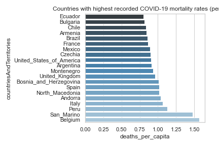
See how different the picture now looks. The UK, Spain and Italy are still represented, but rather better placed in the overall figures. The US drops right down the list and almost disappears from view. No more China. And look at how the list is overrun with tiny countries - San Marino, Belgium, Andorra, Isle of Man, Jersey, Guernsey, Bermuda, Montserrat…
Now it may be useful to consider population sizes when analysing the data sets. Government policies, available resources, the feasibility of certain imposing measures - these are all influenced by the size and wealth of a country. Yet a simple per capita calculation seems to miss the picture. Viruses typically spread at the same rate regardless of population size. Official population counts also under-represent the active population in small countries where people cross borders and criss-cross in complex ways. Surely no-one can say the real story about the trail of deaths left behind by COVID-19 is written in San Marino?
One thing we know is that statistics can be used to tell a story. And we can be sure that when authorities under pressure change the way they use statistics, it is probably because they want to tell a different story.